


Perfil del cliente:Marcas de belleza y cuidado de la piel que operan en los mercados de Norteamérica y Europa (principalmente sitios web independientes de venta directa al consumidor, con los canales de Amazon como enfoque secundario).
Requisitos básicos:Prevención de fugas y roturas, presentación visual de la marca, cumplimiento normativo y acceso al mercado, ritual de desempaquetado mejorado.
Nos contactó una marca de cuidado de la piel que lleva más de tres años operando en el mercado estadounidense. Su producto estrella es un set de regalo de tres piezas que incluye sérum, crema facial y tónico, con un precio cercano a los 100 dólares y posicionado como un lujo asequible.
Sobre el papel, las cifras parecían decentes. Pero cuando la marca se puso en contacto con nosotros, se enfrentaban a tres problemas principales:
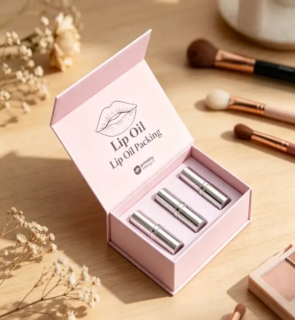
En lugar de apresurarnos a dar un presupuesto, Hanlong solicitó al cliente que enviara un conjunto de muestras del producto a nuestras instalaciones para que pudiéramos estudiar todo su flujo de trabajo de almacenamiento, embalaje y envío. Basándonos en esta evaluación práctica del producto y el embalaje, desarrollamos un plan de mejora integral que abarcaba cada aspecto del paquete.
Para productos líquidos como sueros y tónicos, las fugas son el mayor problema. Diseñamos compartimentos internos individuales dentro de la caja exterior: cada botella tiene su propio "lugar asignado", lo que elimina golpes y vuelcos durante el transporte.
En el caso del envase de crema facial, la bandeja interior cuenta con una base microhendida. De esta forma, en el improbable caso de una fuga, el líquido queda atrapado en la hendidura, impidiendo que se filtre al envase exterior. Este diseño solo incrementó el costo por unidad en unos pocos centavos, pero le ahorró al cliente una cantidad considerable en gastos de posventa.
Sometimos el embalaje a pruebas de caída libre desde más de un metro de altura, repetidas de cinco a seis veces consecutivas. Los productos internos no mostraron roturas ni fugas. Los elementos clave del diseño incluyeron:
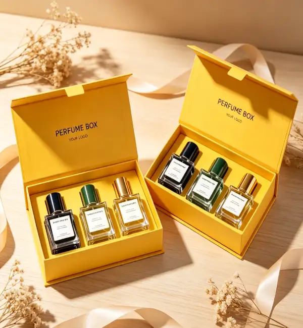
Este era el aspecto que la marca valoraba más. Rediseñamos por completo la secuencia de desempaquetado, transformando el acto de abrir un paquete de una tarea tediosa en una experiencia:
La capa exterior es una caja rígida con cierre magnético y tapa abatible, con un acabado laminado mate suave al tacto; resulta sedosa y refinada. El frontal de la caja luce el logotipo estampado en lámina plateada mate, con una fina línea dorada en el lateral. Al abrir la tapa, el cliente se encuentra con una hoja de papel vegetal translúcido impresa con el eslogan de la marca. Al levantarla, se revelan los productos ordenados a la perfección.
Debajo de cada producto hay una pequeña tarjeta con información sobre los ingredientes y consejos de uso. Esta información detallada anima a los clientes a tomar fotos y publicarlas en Instagram, lo que supone una estrategia de marketing de contenidos gratuita para la marca de venta directa al consumidor.
Desde el color Pantone de la caja de regalo (un color directo personalizado que se ajusta al color principal de la marca del cliente), hasta el gramaje del papel interior, pasando por el material y el acabado de impresión de las tarjetas de agradecimiento, mantuvimos un control total sobre cada detalle para garantizar una tonalidad de marca coherente. Anteriormente, el cliente se había quejado de que los colores del empaque variaban entre lotes, a veces más oscuros, a veces más claros, lo que hacía que los consumidores sintieran que "no se trataba de una marca premium". Esta vez, unificamos los códigos de color Pantone en todos los elementos, igualando el papel, la cinta y las tarjetas bajo una fuente de luz estandarizada.
Todos los materiales de embalaje obtuvieron la certificación de la FDA para contacto con alimentos (para los componentes de las bandejas internas en contacto directo con los productos) y la certificación forestal FSC, entre otras. Esto garantizó que los envíos pasaran por las aduanas de EE. UU. y la UE sin demoras ni retenciones por problemas de cumplimiento del embalaje.
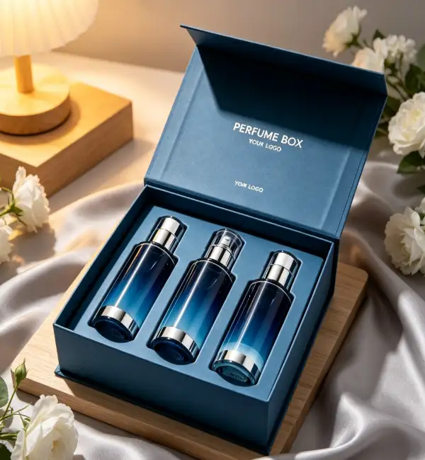
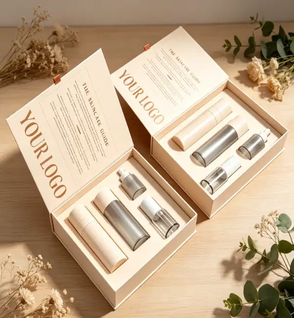
Muchas marcas de belleza parten de la idea errónea de que un embalaje más pesado transmite una sensación de mayor calidad. En realidad, si un frasco de sérum de 200 ml se presenta en un embalaje que pesa más que el propio producto, no solo aumentan los costes de transporte (debido al peso volumétrico), sino que los consumidores pueden percibir un embalaje excesivo. El enfoque de Hanlong se basa en la precisión: calculamos el tamaño óptimo del embalaje a partir de las dimensiones, el peso y el volumen del frasco. Ya sea utilizar EVA o pulpa moldeada para las bandejas interiores, o cartón corrugado de tres o cinco capas para las cajas exteriores, cada decisión se fundamenta en datos, nunca en intuiciones.
Hay otro detalle que a menudo se pasa por alto: el gramaje del papel de las tarjetas de agradecimiento y las hojas de instrucciones. Muchas marcas utilizan papel fino de 80 g que se siente como un folleto. Recomendamos papel de algodón de al menos 200 g o papel especial; la diferencia al tacto es abismal. No subestime el impacto de unos pocos céntimos por unidad; influye directamente en cómo los consumidores perciben el valor de su producto.
¿Estás listo para darle a tus productos de belleza un empaque que ofrezca una experiencia "impresionante desde el primer momento en que lo abres"?