
Cas
Il existe toujours une solution qui vous convient.
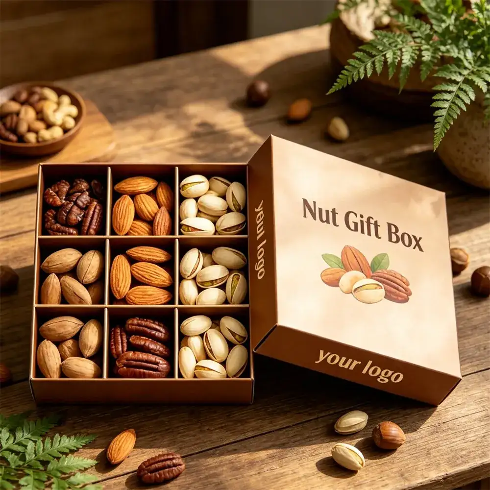
Premium Nuts Gift Box Case Study: 9-Compartment Grid & Morandi Palette — Redefining the Gifting Aesthetics of “Healthy Snacks”
Target Client: High-end nut brands (mixed nuts, daily nut packs, holiday gift sets)
Core Needs:
Sorted Display & Aroma Isolation: Nuts come in all shapes (walnuts, cashews, pecans) and they’re fragile. Needed separate physical dividers to stop them from crushing each other or mixing smells during shipping.
Premium Visuals: Ditch the “loud red and green” souvenir vibe. The packaging needed to signal “natural,” “organic,” and “affordable luxury.”
Easy Access: As a sharing snack, it had to be easy to grab from. And once opened, the box should double as a desk organizer.
Eco & Safety: Direct food contact means materials must be non-toxic. Also needed to align with the plastic-reduction trend.
Project Background: Great Nuts Fear “Mixing,” Gifting Fears “Tackiness”
We worked with a brand that sources nuts globally. Quality was top-notch, but their old packaging was holding them back:
Messy Mix: Old packs dumped all nuts into one big bag, or used cheap plastic dividers. Customers kept getting crushed crumbs and couldn’t see what they were eating.
Cheap Look: Clear plastic bags with a sticker made premium nuts look like bulk bin rejects. Not a gift you’d be proud to hand someone.
No Staying Power: Tossed after eating. Zero brand retention.
They wanted a box that displayed nuts like jewelry but still fit modern home aesthetics.
Hanlong’s Solution: Where Orderly Aesthetics Meet Natural Texture
Structural Design: Grid Partition + Flip-top Book-style Box
Precision Inner Grid: Based on the green and pink cases shown, we designed fixed paper dividers inside.
Individual Compartments:Split into 6 or 9 grids (customized to SKU count). Each cell sized to the nut — bigger for walnuts, smaller for pistachios.
Solid Support:Divider height matches box walls. Keeps nuts from spilling out and protects them from stacking pressure during shipping.
Wide-angle Flip Lid: 180° full open or large-angle flip. When opened, the lid folds flat backward, turning the whole box into a serving tray — perfect for sharing on a coffee table.
Visual Style: Morandi Palette + Minimalist Layout
Color Psychology:
Matcha Green / Pea Green:Signals “natural,” “fresh,” “organic” — fits nuts perfectly.
Dusty Pink / Rose Gold:Targets female buyers or Valentine’s/Mother’s Day gifts. Warm and refined.
Raw Kraft:Emphasizes “original,” “additive-free.” Paired with hand-drawn illustrations for a vintage, earthy feel.
Finishing Touches: On solid-color covers, we used only gold foil or embossing for the “NutBox” logo or brand name. Lots of negative space. Pure minimalist luxury.
Production & Experience
Food-Grade Safety: Inner box paper uses unbleached virgin pulp or coated paper. No fluorescent agents. Safe for direct food contact.
Easy-Open Tear Strip: For fully sealed boxes, we added a hidden tear strip on the side. First opening doesn’t wreck the box structure.
Delivery Results
Price Premium: After the packaging upgrade, the same nut gift set sold for 30% more. Multiple companies picked it for Mid-Autumn/Spring Festival employee gifts.
Repurchase Boost: Customers said “too pretty to throw away” — ended up using them for jewelry or desk supplies. Brand logo stays on their desk long-term.
Breakage Dropped: Independent paper grid absorbed shipping shocks. Nut integrity went from 92% to 99%.
Hanlong Engineer’s Tip
Load-Bearing: Nuts are dense — a box can weigh 1–2 lbs. Bottom board must use high-grammage gray board with lamination, or the base will collapse when lifted.
Moisture Protection: Nuts go soft fast in humidity (especially pecans and cashews). Recommend adding an inner foil bag or PE coating on the insert surface to block moisture.
Dimensional Tolerance: Nut sizes vary by batch. When designing grids, leave 3–5mm extra on length and width. Avoids forcing oversized nuts in or having small ones rattle around.
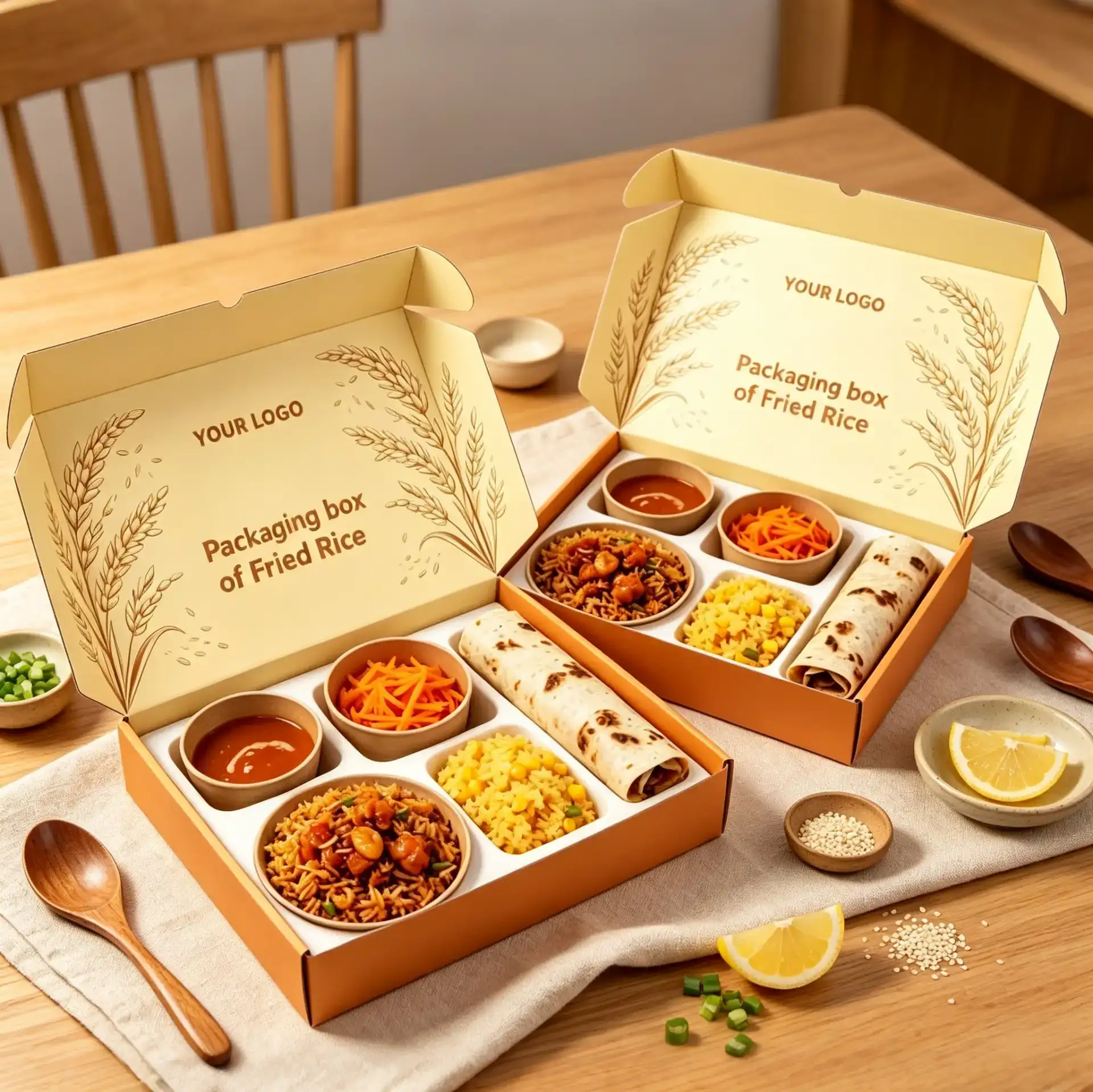
Premium Light Meal & Bento Brand Packaging Upgrade Case Study — Saying Goodbye to the “Takeout Vibe,” Creating a “Mobile Restaurant” Experience with Compartment Gift Boxes
Target Client:Mid-to-high-end light meal brands, corporate catering suppliers (focused on high-AOV set meals, picnic scenarios, and business meeting meals)
Core Needs:
Dry-Wet Separation & Odor Control:Set meals typically include rice/staple, hot dishes, cold plates, soups, and sauces. Must solve soup spills and flavor transfer caused by hot-cold food contact, which degrades taste.
Transit Stability:During delivery or customer pickup, boxes easily come apart or internal containers shift, resulting in a “disaster upon opening.”
Visual Premium:Break away from the cheap foam lunchbox image, boost perceived value through packaging design, making customers feel it’s worth every penny.
Eco Trend:Reduce plastic use, aligning with modern F&B brands’ sustainability philosophy.
Project Background: Great Food, Ruined by “Messiness”
We partnered with a health-focused Japanese-style set meal brand. Their R&D was strong, but packaging had always been the weak link:
Severe Odor Mixing:Previous packaging simply stuffed several round bowls into a large carton with no fixation. By the time it reached customers, curry aroma had contaminated the fruit, and rice was soaked through with sauce.
Lack of Ritual:Opening the box felt like opening a parcel — zero aesthetics. Customers had no desire to photograph or share it on social media, resulting in zero organic buzz.
Scenario Limitations:Due to flimsy, leak-prone packaging, many companies hesitated to order their lunches as business meeting meals, fearing it would hurt their professional image.
The brand wanted a packaging solution that could stably hold all food items like a “serving tray” while being directly presentable at the dining table — a truly “all-in-one” experience.
Hanlong’s Solution: Fusion of Functional Zoning & Visual Aesthetics
Structural Design: Custom Food-grade White Card Insert + Integrated Mailer Box
Precision Die-cut Insert:This was the core highlight. Referencing the green and yellow cases shown in the images, we designed a food-grade white card insert based on the exact dimensions of tableware (round bowls, square containers, long nori boxes).
Lock-in Positioning:Each cavity features precision cutouts. Bowls snap in and stay put — even with vigorous shaking during transit, nothing shifts.
Height Differential Design:Soup bowls sit slightly lower; staple sections sit slightly higher. This height difference prevents the lid from pressing against food while making items easier to grab.
Reinforced Mailer Box
The outer box uses high-grammage kraft paper, white card, or corrugated board. The bottom features a self-locking structure with strong load-bearing capacity — fully loaded boxes won’t deform when carried.
Visual Style: Illustrative Storytelling + Fresh Color Palette
Inside-lid Canvas:Utilizing the large flat area inside the mailer box lid, we printed exquisite brand illustrations. The moment customers open the box to eat, the first thing they see is a beautiful visual, instantly boosting appetite and mood.
Color Psychology:
Warm Yellow:Stimulates appetite, conveying warmth and satisfaction.
Fresh Green:Communicates health, organic, and freshness.
Retro Orange:Evokes energy, gathering, and outdoor vibes.
Production & Sustainability
All-paper Solution: Inserts are made entirely of white card, fully biodegradable. Compared to plastic blister trays, although unit cost is slightly higher, brand favorability increases dramatically.
Flat-pack Shipping:Outer boxes and inserts ship in folded flat form, drastically saving warehouse space and freight costs.
Delivery Results
Satisfaction Rate Surge:After the new packaging launched, negative reviews mentioning “soup leaks” and “odor mixing” dropped to zero. The most-used customer review words became “exquisite” and “straight out of a Japanese drama.”
Social Amplification:Thanks to the beautiful inside-lid illustrations, Instagram UGC volume tripled, turning packaging into a free advertising channel.
B2B Order Growth:With stable structure and premium appearance, the brand successfully secured afternoon tea and meeting meal contracts with multiple corporations.
Hanlong Engineer’s Tip
Oil & Water Resistance:Even with an all-paper package, inserts in direct contact with food must undergo oil and water resistance treatment (usually PE coating). For hot soups or heavily oiled dishes, we recommend double-sided coating to prevent the paper insert from softening and collapsing.
Ventilation Holes:For freshly cooked hot food (like fried chicken or stir-fried rice), complete sealing creates condensation that turns food soggy. We recommend designing micro-ventilation holes on the box sides or hidden areas of the lid to maintain crispiness.
Cutlery Slot:When designing inserts, never forget to reserve space for chopsticks or a spoon! Many designers only account for food containers, leaving nowhere for cutlery — forcing it to awkwardly rest on the lid, which drastically degrades the experience.
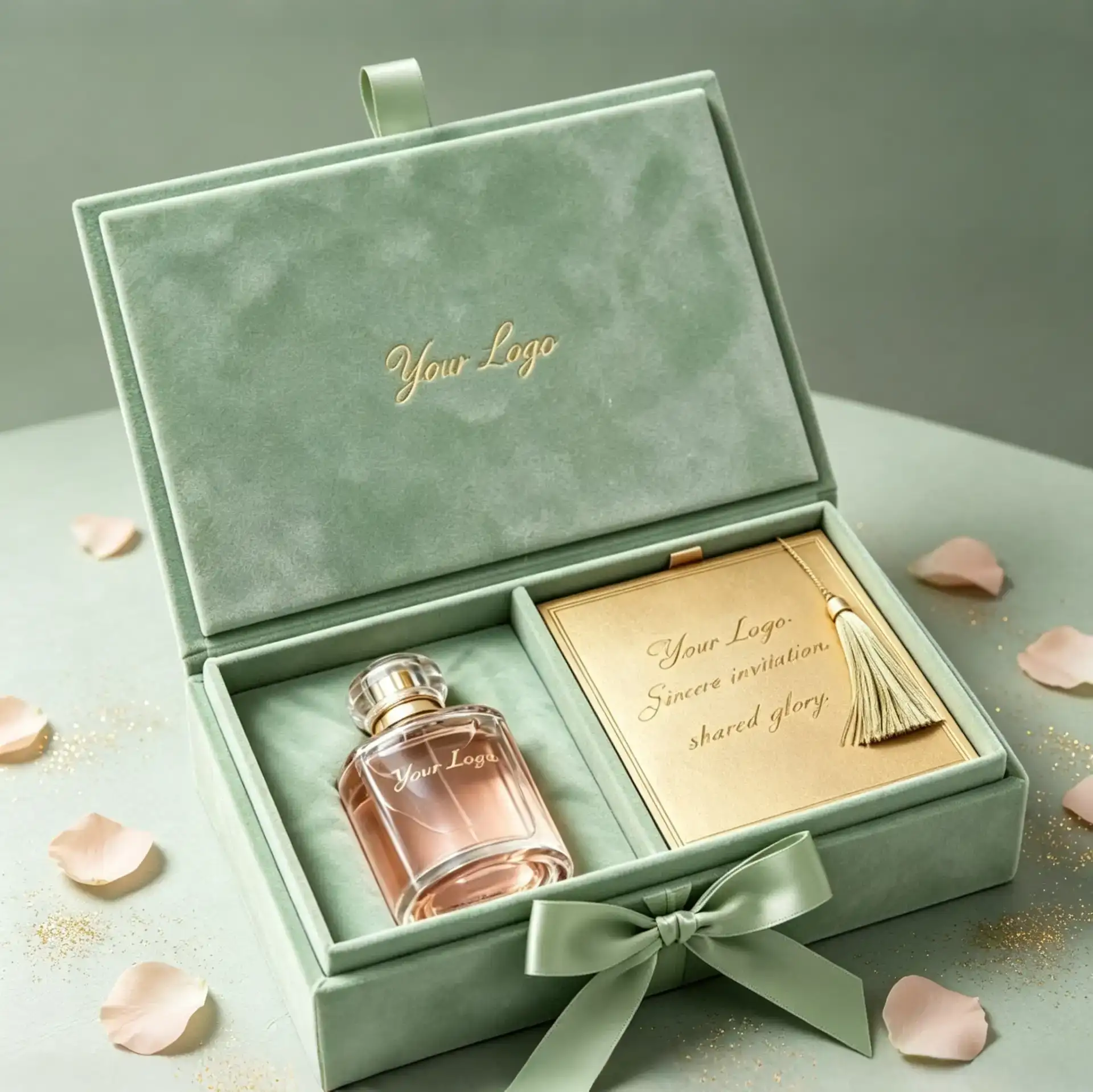
Valentine’s Day Gift Box Case Study for a Beauty & Perfume Brand — Zoned Design & Velvet Texture, Creating an “Unboxing-as-Gifting” Ritual
Target Client:Mid-to-high-end beauty/perfume brands (focused on holiday limited editions and couple gifting scenarios)
Core Needs:
Mixed Loading Challenge:Gift boxes needed to hold both “hard products (perfume bottles/lipsticks)” and “soft decorations (fresh flowers/envelopes/greeting cards)” simultaneously, with zero crushing or damage between the two.
Ritual Atmosphere:As a Valentine’s Day gift, the unboxing experience had to be full of surprises — not sloppy like a regular shipping carton.
Ready-to-Gift Attribute:The packaging itself had to be exquisite enough that customers could hand it over directly without secondary wrapping, saving time and effort.
Texture Matching:Materials needed to match the premium feel of fragrances and cosmetics, avoiding cheap cardboard that would drag down the product’s perceived value.
Project Background: Great Gifts Fear “Messiness,” Ritual Fears “Interruption”
We partnered with a U.S.-based perfume brand that launched limited-edition gift boxes every Valentine’s Day, but their old packaging kept running into trouble:
Product Shifting:Perfume bottles and fresh flowers were mixed together. During transit, bottles would rattle and crush petals, or flower sap would stain the bottles — driving up complaint rates.
Cheap Texture:Ordinary cardboard inserts couldn’t secure irregularly shaped bottles. Upon opening, products would be tilted at odd angles, completely lacking that “gift feel.”
Tedious Assembly:Fresh flowers needed separate wrapping before being placed inside. Labor time was excessive, and during peak Valentine’s Day order surges, shipments were constantly delayed.
The brand needed a custom box that could “perfectly zone” items while making customers “fall in love at first sight,” directly solving gifting pain points.
Hanlong’s Solution: Dual Upgrade of Zoned Fixation & Sensory Experience
Structural Design: 2-in-1 Zoning + Magnetic Closure
Independent Compartmentalized Insert:For the “product + flower/envelope” combo, we designed a custom EVA foam insert.
Product Zone:Precision-molded to fit perfume bottles or lipsticks, embedded with black velvet lining — both anti-slip and visually premium.
Decor Zone:Reserved independent space for flowers or envelopes. Height is slightly lower than the product zone to prevent the lid from crushing decorations.
Magnetic Flip-top Design:Used strong magnetic closure with a crisp “click” sound upon opening, adding an auditory ritual to unboxing. The inside of the lid can feature hot-stamped brand logos or love notes, maxing out the surprise the moment it opens.
Visual & Tactile: Morandi Color Palette + Specialty Paper Finishes
Color Selection:Referencing the case images, we chose low-saturation Morandi pink/blue/green paired with a matte finish, conveying a gentle, romantic Valentine’s vibe that won’t go out of style.
Tactile Upgrade:The outer box uses soft-touch or velvet paper — smooth as skin to the fingertips. The interior features black velvet lining, creating a strong contrast with products to highlight their delicacy.
Production Efficiency Boost
Pre-assembled Inserts:Inserts and outer boxes are pre-glued and fixed. Workers simply place products and decorations, then close the lid. Single-box assembly time is reduced to under 30 seconds, drastically improving peak-season shipping efficiency.
Delivery Results
Complaint Rate Dropped 90%:The zoned design completely solved product-flower mutual damage. Transit damage rate fell from 8% to below 0.5%.
Repurchase Rate Increased:Customers described it as “unboxing a treasure.” Social media photo shares surged, and post-holiday repurchase rates rose by approximately 25%.
Premium Pricing Power:Thanks to the exquisite packaging, the gift box sold at a 40% higher price than previous ordinary versions — yet still sold out, becoming the Valentine’s Day bestseller.
Hanlong Engineer’s Tip
Insert Height:The decor zone (flowers/envelopes) must be at least 5mm lower than the product zone to prevent the lid from crushing decorations upon closure, which would ruin the unboxing experience.
Moisture Protection:Fresh flowers contain water and may cause moisture damage to the paper box over time. We recommend adding a thin PE film barrier at the bottom of the decor zone, or using preserved flowers/dried flowers instead of fresh cuts to extend the box’s shelf life.
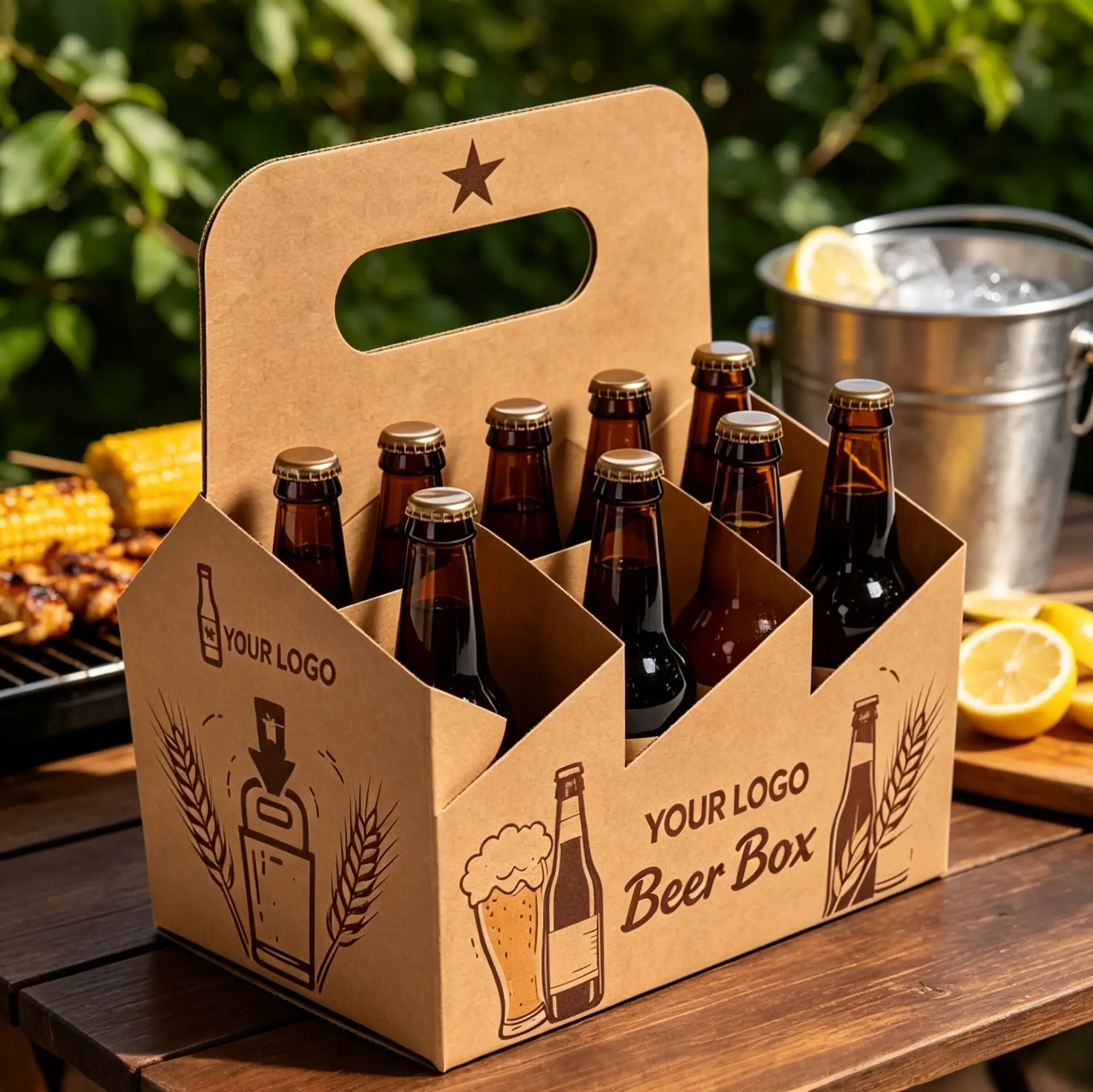
Craft Beer Brand Carry-out Box Case — Heavy-Duty Meets Portability, Creating a “Walking Billboard”
Target Client:U.S.-based craft breweries, fruit wine/sparkling wine brands (focused on brewery pickup, farmers’ markets, and foodservice delivery)
Core Needs:
Extreme Load-Bearing:A 6-pack of glass bottles is extremely heavy, and liquid creates momentum when shaken. Ordinary paper boxes often suffer from handle breakage or bottom puncture.
Portable Experience:As takeaway packaging, it must be easy to carry with one hand without cutting into the hand, suitable for outdoor picnics, parties, and other scenarios.
Display & Protection:Must showcase bottle labels to attract attention while preventing bottles from colliding and breaking.
Eco-Friendly Image:Alcohol consumers prefer natural materials and reject excessive plastic packaging.
Project Background: Great Beer Fears a “Broken Handle,” Takeaway Becomes a Challenge
We partnered with a craft brewery whose signature beers were customer favorites, but their takeaway packaging had always been a pain point:
Broken Handles:Previous packaging used single-layer corrugated to save costs. As soon as customers lifted a heavy load, the handle would snap — there was even an embarrassing incident of “spilled beer” right at the brewery entrance.
Bottle Collisions:No dividers between bottles meant glass clinked against glass during transit. The sound was nerve-wracking, and it often led to micro-cracks in the bottles.
One-Dimensional Scenes:The old packaging looked too much like an “industrial crate,” lacking design appeal. Customers were reluctant to carry it to parks or restaurants, limiting consumption scenarios.
The brand wanted a custom package that could handle 6 heavy bottles while doubling as a “photo prop” on outdoor lawns.
Hanlong’s Solution: Structural Reinforcement & Scenario-Based Design
Structural Upgrade: Double-Layer Stress Distribution + Independent Dividers
Reinforced Handle:Referencing the arched handle structure shown in the images, we applied local double-layer mounting reinforcement at stress points and optimized die-cut rounded corner arcs to distribute hand pressure. It can hold 10kg without cutting into the hand.
Cross-Shaped Divider Insert:Designed a full-paper cross divider inside the box, completely isolating all 6 bottle positions. This not only prevents glass-on-glass collisions but also uses the resilience of paper to form a cushioning layer, replacing foam plastic.
Visual Style: Retro Illustration + Kraft Paper Texture
Material Selection:Used high-grammage kraft paper or white cardboard, preserving the natural paper grain to convey brand values of “handcrafted brewing” and “natural ingredients.”
Graphic Design:Referencing the case images, we used vector illustrations of wheat stalks, hops, lemon slices, and other elements. This style has exceptional texture under outdoor sunlight, making it perfect as a “mobile advertisement.”
Production Efficiency Boost
One-Second Setup:Adopted an auto-bottom structure. Boxes ship flat and can be popped open and locked in one second, drastically saving packing time during the brewery’s busy hours.
Delivery Results
Zero Complaints: After the new packaging was deployed, complaints about “broken handles” and “broken bottles” disappeared completely.
Social Sharing: Thanks to the beautiful design and outdoor-friendly format, Instagram saw a flood of user photos carrying the box at campsites and barbecues, significantly boosting brand exposure.
Channel Expansion: With its outstanding portability, the brand successfully entered the refrigerated shelves of multiple high-end supermarkets. Retailers loved the neat display and damage-resistant packaging.
Hanlong Engineer’s Tip
Water Resistance: Ice-cold beer bottles produce condensation on the surface, and ordinary paper softens and collapses when wet. We recommend applying a water-based varnish or matte lamination on the paper surface — eco-friendly and effectively waterproof and oil-resistant.
Handle Height: Handle height design requires careful consideration. Too high causes swaying; too low risks hitting the bottle caps. We recommend an arched handle height 2–3cm above the bottle cap, ensuring fingers don’t touch the cap hygiene zone when carrying.
Load-Bearing Testing: For boxes carrying liquids, dynamic load-bearing tests are essential. Beyond static suspension, you must simulate the up-and-down motion of walking to ensure glue joints and paper fibers won’t suffer fatigue failure.

Premium Coffee Europe Brand Souvenir Packaging Case Study
Target Client:A well-known coffee Europe brand with 50+ offline stores across Europe (not purely e-commerce; primarily relying on in-store sales and local delivery).
Core Needs:
Mixed Loading Safety: Gift boxes needed to hold both “soft-packaged coffee beans/drip bags” and “hard ceramic mugs/glass pots” simultaneously.
Shelf Display Advantage: Packaging had to look great, “stand firm” on store shelves, and visually communicate “high-quality coffee” to reduce staff selling effort.
Cost Control: As a high-volume souvenir item, per-unit packaging cost needed to stay within a reasonable range — no over-packaging.
Eco-Compliance: The brand’s core value is “green and organic.” Packaging materials must be fully recyclable, with zero plastic foam.
Project Background: Great Coffee Fears “Collisions,” Great Design Fears “Hiding”
The brand had previously launched a “Coffee + Mug” gift set, but ran into major trouble in sales and after-sales:
High Complaint Rate: Due to poor insert design, mugs rattled inside the box. The breakage rate on arrival hit 5%, and often the mug would puncture adjacent coffee bean bags, causing leaks.
Poor Display: For safety, the old box was fully enclosed. Customers in-store couldn’t see the bean color or mug design, relying solely on staff descriptions — conversion rates were low.
Low Assembly Efficiency: The old insert required manual folding and gluing. During peak season, factory assembly costs skyrocketed, delaying shelf stocking.
The brand needed a solution that could “show off” the products, cradle fragile items like a champ, and be suitable for mass production.
Hanlong’s Solution: Balancing Visual Transparency with Physical Protection
Structural Design: Window Display + Full Pulp Molded Insert
Precision Windowing: Referencing the design shown, we created a large transparent PET window (or die-cut opening) on the box lid. This lets customers see the rich SKU combo inside (beans, mug, spoon) at a glance, boosting purchase desire while reducing print area and cutting costs.
Custom Pulp Molded Insert: To solve the “soft + hard” pain point, we ditched traditional foam plastic and designed a full pulp molded insert.
Zoned Fixing: Each compartment was molded to the product’s shape — mug slots feature thickened buffer rings; bean slots are snug and form-fitting.
Suspension Design: Mugs are locked in a suspended position, not touching the box bottom, greatly improving shock resistance.
Visual Style: Minimalist Lines + Earth Tones
Illustration Style: Single-color line art depicting coffee pots, beans, steam, etc., paired with generous white space or dark green/dark brown backgrounds. This creates a “old-school coffeehouse” professional vibe, perfectly matching the brand’s store decor.
Tactile Finishes: Embossing (letterpress) on the logo and key text simulates the granular feel of coffee beans or paper texture, adding warmth to every touch.
Production Efficiency Boost
One-Piece Forming: The outer box uses a mailer box structure — no glue needed, machine pre-creased. Inserts are direct mold-formed. Workers need just 3 steps to assemble and place products, significantly improving packing speed.
Delivery Results
Zero Breakage: Thanks to precision insert locking, ceramic mug transport damage dropped from 5% to nearly 0%. Complaints plummeted.
Sales Boost: After the packaging update, in-store organic sales increased by ~20% thanks to improved product visibility, making it a Top 3 souvenir item of the quarter.
Brand Premium: Customers called it “a box too good to throw away.” Many repurpose it as a storage container, keeping the brand logo visible in their homes long-term.
Hanlong Engineer’s Tip
Window Placement: Avoid placing windows on load-bearing edges, as this compromises box compression strength. If a large window is necessary, we recommend high-strength E-flute or F-flute corrugated.
Odor Isolation: When mixing coffee beans with ceramic mugs, note that coffee aroma can be absorbed by the paper box. We recommend sealing beans in an outer foil bag — this preserves freshness and prevents scent transfer to the mug.
Size Adaptation: Coffee gift boxes usually contain multiple SKUs. Always have the client provide precise 3D dimensions of all products (including the inflated thickness of packaging bags). Insert design should allow a 1–2mm clearance — too tight makes packing difficult; too loose fails at shock absorption.
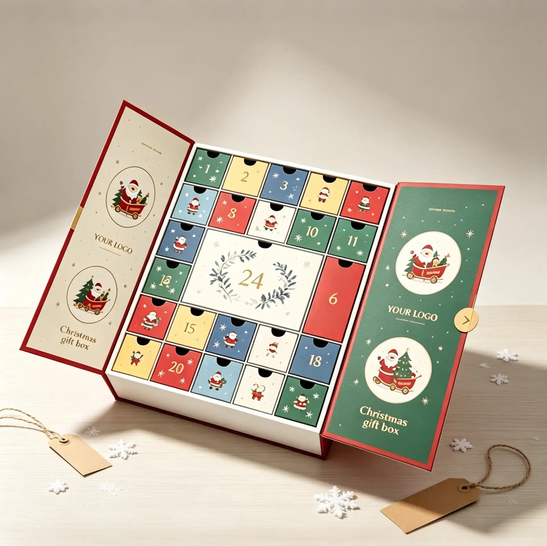
Calendrier de l'Avent d'une marque américaine de beauté en vente directe au consommateur : comment « 24 jours de surprises » ont stimulé les ventes de fin d'année
Clientèle cible : Marques de soins de la peau/maquillage de moyenne à haute gamme en vente directe au consommateur aux États-Unis (axées sur les éditions limitées pour les fêtes)
Besoins fondamentaux :
Rituel des fêtes : Sortez de l’approche ennuyeuse des « produits entassés dans une grande boîte » et fidélisez davantage vos clients grâce à un calendrier de l’Avent.
Innovation structurelle : Il fallait un design qui présente 24 compartiments individuels tout en se dépliant élégamment comme un livre (en référence au style à double porte ou à couvercle rabattable présenté sur les images).
Impact visuel : Couleurs d'impression précises correspondant à l'ambiance de Noël (rouge, vert, or), avec une impression haut de gamme pour le logo de la marque.
Efficacité d'assemblage : Avec 24 petits tiroirs + une boîte extérieure, les coûts d'assemblage manuel étaient extrêmement élevés, nécessitant une optimisation structurelle pour réduire les heures de travail.
1. Contexte du projet
Au quatrième trimestre de l'année dernière, nous avons pris contact avec une marque de soins de la peau basée en Californie. Ils souhaitaient lancer un calendrier de l'Avent pour Noël, mais leurs échantillons précédents leur causaient des problèmes :
Structure fragile : les petits tiroirs se déforment après quelques utilisations, se bloquant parfois même, ce qui engendre une expérience utilisateur déplorable.
Écart de couleur à l'impression : Le « vert de Noël » classique est apparu foncé et d'aspect bon marché, ne justifiant absolument pas le prix avoisinant les 100 $.
Cauchemar d'assemblage : L'usine a signalé que ces boîtes à compartiments multiples nécessitaient trop de main-d'œuvre, ce qui a fait grimper le seuil de la quantité minimale de commande (MOQ).
Leur objectif était clair : créer un calendrier « instagrammable » que les utilisateurs ne pourraient s'empêcher de filmer et de partager sur TikTok.
2. La solution de Hanlong
1) Optimisation structurelle : De « l’ajustement forcé » à « la douceur soyeuse »
Pour la structure à double porte/toit rabattable présentée sur les images, nous avons effectué deux ajustements clés :
Conception à nervures de renforcement : Des points de renforcement cachés ont été ajoutés aux zones de tension des 24 petits tiroirs, garantissant qu’ils ne se déformeraient pas même en cas de tractions répétées.
Fermeture double magnétique et ruban : La boîte extérieure utilise de puissants aimants associés à un ruban (comme illustré sur la photo), assurant la sécurité du transport tout en ajoutant au rituel du déballage.
2) Restauration visuelle : Couleurs Pantone + Procédés de retouche sélective
Impression en tons directs : Abandon du CMJN standard, utilisation d’encres Pantone pour le rouge de Noël et le vert vintage afin de garantir des teintes riches et saturées.
Amélioration tactile : Marquage à chaud (feuille d'aluminium) ou gaufrage appliqués sur le logo et les chiffres, créant une différence de texture distincte qui peut être ressentie du bout des doigts.
3) Efficacité de la production
Technologie de pré-pliage : La boîte extérieure et les grilles intérieures étaient pré-pliées à la machine, ce qui permettait aux opérateurs de les emboîter et de les assembler facilement. Cela a permis de réduire le temps d’assemblage d’une boîte d’environ 30 %.
3. Résultats de la livraison
Succès sur les réseaux sociaux : La vidéo de déballage publiée par la marque sur TikTok a généré des centaines de milliers de vues, et les recherches pour le mot-clé « Déballage » ont explosé.
Succès commercial retentissant : Le premier lot de stock a été épuisé en moins de deux semaines, devenant ainsi le produit numéro 1 de l'année.
Zéro plainte : Grâce au renforcement structurel, les plaintes concernant les dommages liés à l'expédition et les tiroirs bloqués étaient quasi inexistantes.
4. Conseil de l'ingénieur Hanlong
Le contrôle des tolérances est essentiel : si les tolérances des 24 compartiments ne sont pas rigoureusement contrôlées, les dimensions totales s'écarteront considérablement, rendant impossible leur rangement dans l'emballage extérieur. Nous maintenons généralement la tolérance de chaque compartiment à ±0,1 mm.
Choix du matériau pour le plateau intérieur : Pour des raisons écologiques et économiques, nous recommandons l’utilisation d’inserts en carton plié plutôt que de blisters en plastique. Si le système d’emboîtement est bien conçu, la stabilité est équivalente à celle du plastique.
Anticipez : la fabrication des boîtes de Noël nécessite des procédés complexes comme le marquage à chaud et l’impression en couleurs d’accompagnement, ce qui allonge le délai de production de 2 à 3 semaines par rapport aux boîtes standard. Nous vous recommandons de passer commande au moins 3 mois à l’avance.